Designer: Frank Ligthart - Obelisk

Inspiration comes from a variety and a surprisingly array of sources. We never know what will strike us. After all, E. L. Doctorow leaned back in his chair one day and stared at a patch of stain on the ceiling. From that single image, he created Ragtime.

Dutch-born designer Frank Ligthart was inspired by the ancient Neolithic standing stones of Carnac, France.

He created a set of furniture – four chairs and a table – with each piece on its own usable and interesting, yet harmonious when all fit together. It creates an 8'-0” tall sculptural structure by stacking four chairs and a table together in the form of an upright torpedo. He calls it Obelisk.

His Obelisk furniture is much more comfortable that the stones of France. While it may not last all those years, it is plenty durable. The fibers are woven by hand over lightweight and rustproof frames. It resists stains, ultraviolet light and bacteria.

It is also a space saver -- when stacked, the obelisk forms take up less than 4’-0” of floor space.

Yes? No? Maybe So? Would any of you place these furniture items on your patio in the back yard? Around a pool? Leave the obelisk structure in the corner of the yard when not in use?

Available in platinum as shown in the top images, but also in smoke. Janus et Cie carries this for Dedon for just a mere $7,870...

Designer: Bertha Schaefer (1895-1971)

Few women designed furniture during the inter war years. We all know Florence Knoll and Ray Eames. But many of us have not heard of Bertha Schaefer. She designed furniture along side some pretty big names.

Schaefer began as an interior designer -- an acceptable vocation for a woman because at that time women were recognized as having a natural instinct for the placement of color and objects. After all, it was only natural. Planning, spatial relationships and mathematics, it was believed, would only strain their heads. This was something reserved for the male domain. Bertha Schaefer designed alone, she didn’t have any husband to partner with who could help expose her talents and skills.

Bertha Schaefer expanded the definition of decorator to designer. She then expanded the definition of designer to innovator. She was pioneer in integrating fine and applied arts with interior design. She owned businesses and an art gallery. She created her own furniture designs and had them mass produced.

Treadway, September 10, 2006: Schaefer's Dining Table, manufactured by Singer, 1950s, round walnut top raised on four tapered legs, original finish. Realized - $800

Born in 1895 in Yazoo City, Mississippi to Emil and Julia (Marx) Schaefer, she grew up there with a sister and a brother. They lived in a house designed by their father that was traditional by no means. This was to have an effect on her decision to study interior design. Schaefer obtained a B.A. from Mississippi State College for Women. After a stint working in the statistics department in Washington, Schaefer returned to Mississippi. She felt different than the other girls there and wanted to escape the dusty hot Mississippi roads. Schaefer left for New York to attend the two year interior design program at Parsons School of Design. After graduating she headed to Paris for five months. When she returned to NYC, she landed a job with Helen Criss, interior designer, who couldn't keep her long for financial reasons. So in 1924, she opened her own business: Bertha Schaefer, Interiors.
Treadway Toomey, September 14, 2008 – realized $800: Bertha Schaefer coffee table, produced by Singer & Sons, travertine top raised on walnut base with six sculptural curved supports, signed with paper label.


She designed interiors for private homes, apartments, hotel lobbies and restaurants. Although she designed and altered pieces of furniture here and there, her design emphasis, actually, was on lighting. She believed in functional and economical lighting fixtures. By 1939, she was one of the first to use fluorescent lighting in residential applications. By 1954, she was tackling a model bathroom for General Electric and designed the interior of Temple Washington Hebrew Congregation. But it was this functional and economical way of living that she employed in her furniture designs.


Sold at Rago, October 28, 2007 and also in April of 2007 both for $2,400, Schaefer for M. Singer & Sons. Italian walnut.

In the 1940s, her interests turned to Contemporary art. She was eager to put into action the idea that art should not be chosen based upon the idea that it matched with the décor. In fact just the opposite, she believed one should choose a painting first and then build the room around it. In 1944, she opened the Bertha Schaefer Gallery of Contemporary Art. There she featured fine art, sculpture and furniture.

She was a proponent of the German Bauhaus School and believed that economical designs could possess both craftsmanship as well as beauty. Her gallery was an arena to exercise her ideas and in 1947, she curated a series of exhibitions titled “The Modern House Comes Alive”. She debuted what she considered to be the American counterpart to the European movement.
Sold for $4,800 at Sotheby’s NYC December 9, 2005. Currently available at Red Modern Furniture.

Her furniture designs caught the eye of Joe Singer of M. Singer and Sons Furniture Company in New York City. He liked Schaefer’s ability to marry fine arts with commercial arts, which she displayed in her furniture designs and in her gallery. In November of 1951 during a week-long trade show, Schaefer debuted fifteen furniture pieces along side twenty-one pieces by ground-breaking Italian designers such as Gio Ponti, Carlo Mollino, Carlo de Carli and Ico Parisi. With the introduction of their designs came a new influence in furniture design in America. Modern furniture was perceived as cold and aseptic, some even called it sterile. But Schaefer, by herself, had gone a step beyond functionalism and provided interest to the viewer with her beautifully molded wooden forms.
Available at 20th Century Interiors.

Schaefer continued to design modern furniture for Singer from 1950 to 1961 and often co-designing with Gio Ponti. Many of her design forms predate her introduction to these Italian designers. It is interesting to note that her furniture items sell for considerably less compared to these other names – (though Carlo Mollino blows everyone out of the water.) American and not Italian, yes. Name recognition, not as well known. Trained as an interior designer and not an architect, true. Items she co-designed with Gio Ponti go for more. But why isn’t she as well known for her furniture designs? I don’t know enough to provide an answer. Any thoughts out there?
This poison will linger in all our veins even when, the fanfare returning, we are delivered again to the old disharmony. Oh, we now so worthy of such tortures, let us fervently grasp this superhuman promise made to our created bodies and souls: this promise, this madness!

~ Rimbaud
'Drunken Morning’
From Les Illuminations


I’m rebounding from the echoes of last night. Non-stop I had to work, hour after hour, day after day, for weeks I labored over my computer. I had an enormous project to turn in which had been weighing heavily on my mind since the start of the year. In the wee hours of each night, I would waddle to bed stiff from the permanent C-shape my body had formed as I hunched over my old, outdated laptop. My hand developed the form of a claw that ached from hours and hours each day grasping my mouse. At night, I was barely able to hold a toothbrush to drag it across my teeth. And when I finally completed the project, I didn’t take time to celebrate. I had baskets of laundry to do and tumble weeds of dog fur to clean which had collected underneath the furniture from three weeks of neglect. I was also overdue making dinner for my understanding husband. It seemed a good idea to open a few bottles of wine while I tackled these tasks. So I began to sip the dark red contents of my glass and felt it slide past my throat and into an empty and growling stomach while I stuffed the chicken breasts with a particularly tasty Caribbean recipe.

As I cooked I sipped and my shoulders began to lower. They had been at the level of my ears for some time. My back was in less pain. I felt circulation in my legs again. By my third glass, I let out a few giggles. By the fourth glass, I recall myself shrieking in laughter at “Kathy Griffin My Life on the D List” which ran in the background. And by the end of the bottle, I decided to take my dog for a midnight walk. I believe at this point I was skipping down the street and humming a tune, my kitchen apron still on. My dog and I decided to take a detour through a neighbor’s yard running through their sprinklers.

It was hot out last night. The steamy air was too stagnant for even insects to fly through. We needed to cool ourselves off. And it seemed like a good idea at the time.

Poets such as Baudelaire and Rimbaud believed in the “disarrangement of the senses”-- a practice which would inhibit the natural filtration and categorization of information we are methodically taught how to do in school. They did this with the aid of alcohol (and later music performers such as John Lennon and Jim Morrison exercised this through other types of chemicals….). Although I am a believer in the deconstruction of information and finding one’s own methods of relaxation, I am sorry I didn’t stop after my second glass.


I never finished cleaning the floors last night and I am having difficulties completing that task today. My eyelids are as heavy and gritty as sandbags and my brain feels like a dried nut rattling noisily against the insides of my head. My skin dry, my hair flat and my tongue thick. But the worst of all is that I am guilt ridden. I have wasted time today too worthless to do much. I have more work due and I have put people off. I didn’t even benefit from an evening out spending time with friends. Instead I cooked, drank, walked my dog then lost my head. Not a morsel of significance to the evening. The after effects of alcohol are unfair, but it certainly feels so right at the time.

Architect: Mary Rockwell Hook (1877-1978)

Mary Rockwell Hook once described a troubling time in her early years when she was studying at the École des Beaux-Arts. After class, she had to run as fast as she could to a taxi as she dodged buckets of water being thrown at her by disgruntled male students. She was the only girl in her class, and the second American female to attend after Julia Morgan. The year was 1906.

This hostile gender bias wasn’t anything new. Previously, she studied at the Art Institute of Chicago, the only female in her class she experienced similar behavior. Some parents thought that young men could not learn to their full potential with a young woman present. Many parents wanted their money spent on a solid education for their sons. The fairer sex was much too distracting, it was thought. This theory still holds true today by some parents. But a more prevalent theory was that architecture was a male domain and considered no place for a lady.

The house she designed for her parents. 1908. It was the first home in the area to have a built-in garage. The city didn't know what to do with this. It conflicted with regulations, so she had to put in a fire-proof steel garage door which still exists today. The house originally had outdoor porches which have since been enclosed.

Upon Mary Rockwell Hook’s return back to the United States, she applied for a job with an architecture firm. They turned her down because of the simple fact that she was a female, and they didn’t want to watch her climb all over life-sized models. But MRH was not intimidated. She was driven and had the support of her family behind her. Another architecture firm did accept her, but her father did not like the idea of Mary working for a salary. Aware of her well-trained solid skills, he commissioned her to design their family home in Kansas City. It was here where she launched a prolific career as one of Kansas City’s most innovative architects and became a pioneer among professional women.

One of my favorites. I went to a small school in this area and when I had to around the hilly neighborhood for soccer or field hockey practice, I used to admire it.


She did have a number of things in her favor. Born on September 8, 1877 in Junction City, Kansas, she was the third of five daughters, (sandwiched between Florence, Bertha, then Catherine and Emily). Her parents insisted on the highest standards of education. She graduated from Wellesley in 1900 and her father’s successful business in banking and grain elevator business allowed for Mary to travel widely.

I’m partial to her houses. Mrs. Blandings introduced MRH a number of months ago, of course presenting the story of MRH very well. I am attracted to MRH’s designs for her open floor plans mixed with a little bit of the unpredictable. Although her designs are asymmetrical, there is something incredibly harmonious and balanced about them. Older houses in Missouri have always possessed a quirky twist. Mid-western architects provided their own interpretations on East coast designs with a dash of European idiosyncrasy. MRH did just that. But each one of her homes has a well thought-out spatial plan with interesting, unique appointments.


I am of the belief that a woman is -- if living with the opposite gender -- truly the head honcho of the home. She is the one, no matter how progressive the relationship is, who is ultimately responsible for a well-ordered home. Therefore, it makes sense to me that she would have invaluable insight of the structure, the circulation patterns, storage space and light. No one knows the flow of the house better than the one who is responsible for maintaining it.

The house she designed for herself where she lived with her husband who she wed at the wise age of 44.

Many types of female birds are in charge of the construction of the nest. She is the one who decides the location. She has her chicks to think about. She knows that she needs to build her nest on a sturdy branch. She knows she needs protection from the weather and from predators. She delegates to the male about gathering twine and twig of all sizes. It is the mother bird who stays behind to manage construction and place every piece with astounding accuracy.

So, I applaud Mary Rockwell Hook. She is one of Kansas City's pioneer mother birds. She was one of the country’s first architects, and formed an architectural partnership with Eric Douglas Macwilliam Remington. She worked throughout the United States – from Colorado to a sandy key off the coast of Florida. She was the first to use cast-in-place concrete walls. Many of her aeries can be seen in the Sunset Hills around Loose Park. MRH used recycled materials such as a slate roof from an old church, and thick beams from abandoned railroad bridges. She liked to juxtapose the rough with the elegant. She combined stone and brick with tall broad windows conscious of bringing the outdoors inside. She wasn’t afraid of much and took risks. She even was known to construct small platforms or stages in various rooms throughout houses for an occasional and impromptu piece of theatre. I think in her own words Mary Rockwell Hook describes her work best, "Houses should be fun".

Mary died on her birthday 101 years after her birth.

My apologies featuring the houses from afar. All photos by me from my camera as a lurker on the streets.

Vampire Killing Kit


“How then are we to begin our strife to destroy him? How shall we find his where; and having found it, how can we destroy?”


So Bram Stoker wrote in his infamous novel Dracula, published in 1897. Dracula, the compelling creature of the night, gained immortality by biting the swan-like necks of fair maidens and sucking their blood. A most terrifying figure, he was also portrayed as handsome aristocrat, well-dressed, and impeccably groomed (he was, after all, a count). He was dangerously seductive until the moment he sunk his teeth into a beautiful woman’s alabaster neck, upon which his face turned ghostly, exposing his pointed teeth and flaming red eyes. It was feared that women would invariably succumb to his charms.

The vampire is one of the most pervasive and recognizable symbols of evil in Western culture. He possesses supernatural powers; he is different than other evil monsters such as the hairy werewolf or clumsy Frankenstein. He is not easily recognizable. The image of the vampire is flexible. He can be so many different things -- a threat to society, at the same time he can serve as an enticement from our hum-drum lives. He is alluring and that kind of phenomenon, a supremely evil creature disguised as a man of charm and good breeding, has tremendous appeal in our culture. The concept is seductive.

So impressive was the impact of the vampire on certain people -- so real did he seem to be -- that people were warned to have weapons to deal with the presence of a vampire.


Steven's Auctions: Fully equipped with holy water, garlic, cross and candles, this kit sold in October 2008 for $15,000.


Elaborate kits were crafted -- wooden boxes the size of a briefcase stuffed with all the necessary accoutrements to eliminate the vampire: crucifix, bible, a pistol, silver bullets, a rosary, vessels for garlic powder and various serums that could be injected intro the vampire.

What was the origin of these objects? Some vampirists claim such kits were common in the eighteenth and nineteenth centuries, while others claim many were more likely assembled following the publication of Bram Stoker's Dracula and marketed to anxious British travelers to Eastern Europe. Forests were dense and the fog heavy in Eastern Europe. Tourists took a huge chance by going there; if they did they needed the protection.


Mercer Museum in Doylestown, PA


A Professor Ernst Blomberg’s name appears on the label of many of these kits. On it he requests that the purchaser of the kit carefully studies the kit and should evil manifestations become apparent, he is adequately equipped to deal with them efficiently. The existence of Professor Blomberg has not been confirmed. Whether the whole things was a hoax or not, it didn’t matter; the image of the vampire in Western imagination was very vivid and real.

One thing is for sure and that is these kits have been selling for a lot of money on the market.

Garth's Auctions: September 1, 2006


Why are we so fascinated with vampires? This fascination did not begin with Stoker, two centuries prior to the publication of his book; there was a hysterical rash of vampire epidemics reported in Eastern Europe. In 1704 a book entitled Magia Posthuma was published by a Catholic lawyer named Karl Ferdinand von Schertz. Von Schertz examined reports of the living dead who roamed about in Moravia and other places and harming the living. Two decades later Austrian officials were investigated a similar case that was reported in northeastern Serbia. The locals there called the mysterious figure a “vampire”.

As the decades went on more cases were reported. Local people developed several means by which they could control a vampire’s activities. The best method to neutralize a vampire was to drive a wooden stake through his heart. To be on the safe side, it was recommended that the vampire be decapitated and his body burned.

In Russia, Romania and the Balkan States, people in the eighteen century believed that the soul didn’t depart from the body it inhabited until forty days after death. They also believed that the soul could linger for years, which would delay decomposition of the body. To check on this, bodies were dug up after a period of years. If, after a certain length of time, there was no evidence of decomposition, it was believed that the corpse was that of a vampire. However, if there was evidence of decomposition, the bones were cleaned with water and wine, wrapped in linens and reburied.


Vampire kit disguised as a book. Garth’s Auctions – September 1, 2006

The vampire phenomenon caught on quickly in certain parts of Europe. By 1734, for example, the word “vampire” had entered in the English language. Those early vampires were described as frightening grotesque. Their bloated faces turned purple from drinking blood; their fingernails grew long, and their bodies exuded a horrific smell. Out of fear, knowing that vampires could appear dead when they were just sleeping, as a precautionary measure, people would dig up graves, open the coffins and ram a stake into the hearts of the corpses.

In 1755, Empress Maria Theresa sent a renowned scientist to the Slavic region to find out more about vampires. She began passed laws forbidding the exhumation and destruction of corpses. The Habsburg Empire brought the oral folklore from the Balkans and Transylvanian region to the Western mind.
Sotheby’s: April 20, 2007. Realized: $7,200


Gradually, the vampire motif began to creep into the European consciousness. It attracted the attention of artists, scientists, clergy, and scholars and of course the general population. It also caught the imagination of poets and authors of gothic fiction which by the mid-eighteenth century had become very important to middle-class Victorians. Dead corpses were believed to be able to rise through the earth; tales of this phenomenon were written down, plays were performed. By the time of the Victorian era, the fear of decomposing corpses, and all the harm they could cause, infected the society to an almost hysterical degree.


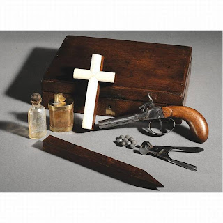
Sotheby's, New York: October 8, 2004. Estimated: $4,000-$6,000; realized price: $26,400

In it contains:
(1) An efficient pistol with its usual accoutrements
(2) Silver bullets
(3) An ivory crucifix
(4) Powdered flowers of garlic
(5) A wooden stake
(6) Professor Blomberg's new serum


Dracula represents a universal fear of premature burial, wherein a person might appear to be dead but is actually still alive. Why we still have this fascination, I am not sure, but it translates across genders and we see movies and television shows about it. One thing for sure, is vampires are always good looking, well-poised and very refined. You don’t see any hillbilly vampires.


Check out the vampire kit at Manions Internatonal Auction House.

Artus Van Briggle

A talented potter, who I share an affinity of name, experienced a short but very successful life. I wish he left behind more examples of what he was capable of as well as his take on the changing styles through time. We know him for his creation of rare designs and the unusually soft satiny dull matte glaze he worked so hard to get just right.

Born in Felicity, Ohio in 1869 Artus Van Briggle showed an unusual artistic talent as a small child. By the age of 17, he boarded a steamboat and headed for Cincinnati to paint the faces of dolls for Arnold Fairyland Doll Store. Soon after, he apprenticed at the Avon Pottery Company and then moved to a position of decorator at the Rookwood Pottery Company. Mrs. Storer, the founder of Rockwood, recognized his superior talent and arranged to have him study in Paris. In 1893, the slender, auburn-haired and freckled-faced young man said goodbye to his family and friends and left to attend the Julian School of Art. While in Paris he saw examples of Chinese Ming pottery and was memorized by the glaze. From this moment on, he was determined to find a way to recreate this velvety matte finish. He also was highly influenced by the newly emerging Art Nouveau style which was apparent in the designs he was later to create. While in Paris, he met and fell in love with a fellow American student, Anne Lawrence Gregory. They became engaged with plans to marry, but the wedding was postponed.

Upon his return in 1896, he was granted the position of head decorator for Rookwood. In the evenings, he experimented with what he saw in France. The Art Nouveau style in pottery was a new departure in art pottery. It employed solid glazes and with a wider range of colors. Artus worked with low relief designs in the clay, experimented green, orange, purple and azure blue pigments, and continued to work on creating a formula for his glaze. His time fully occupied, he was driven and he was taxed. Constantly working with little sleep, he feel victim to tuberculosis.


At the turn of the century, many people were packing up and heading for Colorado Springs in search of dry air and sunshiny days. On the advice of a friend, he moved there in March of 1899. Before he left, Artus believed that he had finally discovered the secret formula the Chinese had use centuries before. He wrote it down, sealed it up and bequeathed to the Rookwood Pottery. This was not to be opened except in the case of his death. On a ranch southwest of Colorado Springs, he recuperated. As he gained strength, his indomitable desire drove him back to the potter’s wheel.

Lorelei Vase shows the Art Nouveau influence he was exposed to in Paris.

Artus met Professor William H. Strieby, a scientist and head of the department of Chemistry of Colorado College, who gave him advice about his glaze and offered him a corner of his laboratory. Artus was more determined to perfect his glaze working with the rich Colorado clay.

Although Anne Lawrence Gregory moved back to the states the same time as Artus, she remained in Pennsylvania. Something changed, still engaged, she packed up and moved to Colorado Springs in 1900. She taught art at Colorado Springs High School and worked closely with Artus in his studio. By December 1901 they had collaborated creating 300 pieces of pottery all of which sold at a Christmas sale. Anne became a working partner producing many of the early pieces bringing some of the highest prices on the market today. Anne and Artus collaborated to create their logo of the conjoined double A enclosed in a square. Artus was confident now and believed in the allure of his matte glaze.


In the spring of 1902, supported by leading business men of Colorado Springs, Artus formed Van Briggle Pottery Stock Company. In June of the same year Anne and Artus invited a few of their friends together, went to a spot on the Mesa of Cheyenne Mountain, stood in the shadow of a tree and exchanged vows. 1902 was a good year; Van Briggle pottery was also receiving national attention for the designs and the alluring glaze.


Rago, March 8, 2008: Poppies and pods with matte burgandy glaze, 1902.


At the height of success with his pottery and his working collaboration with his new wife, Artus fell ill again in 1904 and died at the young age of 35. Success did swell his head, his co-workers and peers said he always maintained a balanced modesty. Anne carried on winning numerous exhibition awards throughout the country. In 1906-1907, Anne received the highest award given by the Boston Arts and Crafts Societies – the Degree of Master. She wanted to construct a new building in his memory. In 1907, she hired her friend Dutch architect Nicholas Van den Arend who created a structure out of brick styles after a Dutch farmhouse. The building was completed the following year. Anne and her assistants created al the tiles and terra cotta elements that adorned the building. After the death of Anne, the pottery changed hands again and again. Something along the way was lost, I feel. The interesting array of calm colors and the velvety finish still remain, but the spirit and sense of freedom gone.


The memorial building was purchased by Colorado College in 1968 the tile floors, fireplaces and details carefully preserved.


Treadway Toomey, March 8, 2009, Carved floral design, green and maroon matte glaze, 1905.


Leslie Hindman, April 14, 2008. Date unknown.


James Julia, August 24, 2006: Ewer, rich mauve glaze. Second half 20th century.

Alpine Chic

Does anyone recall the opening scene of Charade (1963) with Audrey Hepburn dressed impeccably Alpine-chic in Givenchy? What happened to that stylish mountain look surrounded by the modish interiors?

When we think of Mountain interiors, we don’t tend to think of chic. Most mountain retreats have the super 70s look with knotty pine lined interiors and furnishings that haven’t changed since then, including the gold and orange towels hanging in the bathrooms.


Then my mind wanders to Suzy Chaffee of the late 70’s, the Olympic skier who caused a national sensation as “Suzy Chapstick,” as she ski danced in the popular Chapstick® lip balm commercials.

Settee available at Daniel Barney antiques in NYC.


If updated, the furniture in mountain retreats is overstuffed with lots of fur pelts and horn furniture. I am not sure how I feel about horn furnishings. I’m fond of drinking wine in high altitudes, so I fear the heel of my shoe would clumsily snag on the shag rug and I would fall and poke an eye out on one of the horns.

Today’s television shows and movies reference most alpine homes as small cabins on the brink of collapse with two characters trapped inside as the result of an avalanche. Or they feature an old military vet with a Grizzly Adams beard making a soup of tree bark and roots. Most alpine structures are used to escape the harsh weather and/or to hide because Big Foot is outside. I can't think of a film that shows the opulent interiors of some place nestled in the mountains of Colorado. Somehow scenes always have to involve girls similar to the inebriated cast of "Girls Gone Wild" bouncing around in hot tubs. If we go back in time to 1984, Hot Dog: The Movie had scenes of hot tubs, wet T-shirt contests (I can barely type that without vomiting) and the typecast character of the wealthy older woman seducing a younger naive man. Not much has changed in over two decades.


The Overlook Hotel in the movie The Shining (1980) is creepy at the same time appealing with its stark lack of colors juxtaposed with the David Hicks-esque broad patterns on the carpet. If I remember, there are antler chandeliers somewhere in the hotel. Jack Nicholson’s character suffers from cabin fever in the mountains and goes on a murderous rampage. Sometimes, when you’re high up in the mountains with not much around, things do get a little… spooky.
Available at Ad Lib Antiques in Hudson, New York.

Antler chandeliers do not make me nervous. In fact, I’m a fan. But moving on…

There is a scene in Pillow Talk where Rock Hudson brings Doris Day to a lake house in the mountains. The house is pretty refined. Now we’re getting closer but we have had to go all the way back to 1959. You would think there would be dozens of scenes in movies that take place in front of a roaring fireplace with people sipping cognac and wearing the latest winter fashions.


The best one I can recall is the cantilevered house in North By Northwest. The interiors are fantastic. (I can't find a picture...)


So what does everyone think? Do we stay with the same over sized leather furniture, knotty pine tables and scattered bronzed antelope candle holders as found in the book Mountain Style?


Do we Ralph Lauren it with the Black Mountain line from 2005 (I think)?

Or do we try something entirely new?